 עיצוב ותכנון רשת חנויות בברזיל
|| פרויקטים
עיצוב ותכנון רשת חנויות בברזיל
|| פרויקטים
Project name: Carrefour Express
Architecture: Aquadrado Arquitetura
Lead Designer/Architect: Renato Fregnani and Isabela Junqueira
Concept and Communication: Amanda Palmeiras, Beatriz Marcolin, Charles Cruz, Lucas Santos, Rodrigo Pascoto, Felipe Padilha, Marco Pedroso and Humberto Nunes
Architectural Executive: Edney Silveira, Priscila Feltrin, Carolina Ibrahin e Queren Coschitz
Luminotechnical Project: Foco Luz e Desenho
Grupo Carrefour Brasil, הקמעונאי והמעסיק הפרטי הגדול בברזיל, השיק את הזיכיון של Carrefour Express, אשר מאיץ את התרחבותה ומחזק את האקוסיסטם של החנויות ושירותי לקוחות.פורמט הקרבה של Carrefour Express, המאוחד באזור המטרופולין של סאו פאולו, הוא אידיאלי כדי לענות על הצרכים היומיומיים של צרכנים, שיכולים לעשות את הקניות שלהם בכל מקום בדרך קלה ופרקטית. כדי לענות על הדרישה הזו, פותח פרויקט חדש של ארכיטקטורה קונספטואלית ותקשורת חזותית על ידי משרד האדריכלים Aquadrado Arquitetura בשיתוף עם Grupo Carrefour Brasil, שעבד עם Grupo Bittencourt במבנה העסק. מטרת הפרויקט הייתה ליצור חנות שתיצור קשר טוב יותר עם הלקוחות,
מתוך סביבה מסבירת פנים ומשולבת בחיי היום יום של השכונה בה היא ממוקמת.
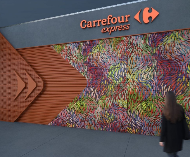
Photo Credit: Aquadrado Arquitetura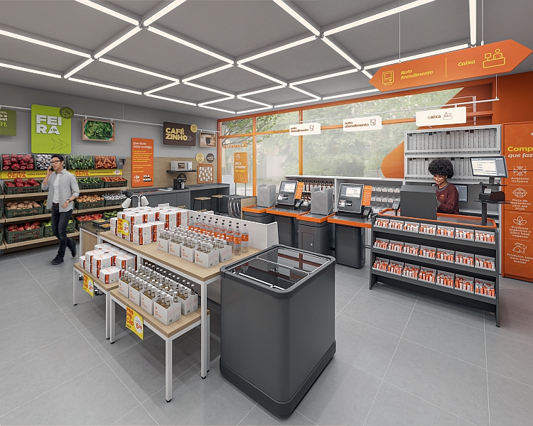
Photo Credit: Aquadrado Arquitetura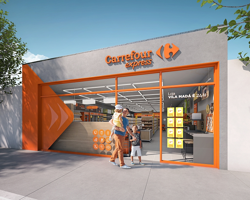
Photo Credit: Aquadrado Arquitetura
The model store was carefully designed based on three conceptual pillars: modularity, scalability and communication. One of the main
challenges was to idealize a project that would offer solutions adhering to different types of investments - enabling the implementation with the expected return for the franchise - and store models - ranging from 15 to 200 m² of sales area and in three formats: street and .shopping centers; in company; autonomous in residential condominiums
The equipment and materials were planned in a flexible way, ensuring standardization and low complexity of execution. The store's communication was designed to provide a pleasant browsing experience that inspires and brings relevant information to customers
Four versions of facades were created to ensure the adaptability of the project in different regions. For example, there is a version where the façade features a new recycled wood slatted element, combined with a soft orange tone, conveying a welcoming feeling. A strategically placed screen displays Carrefour institutional information and special store promotions.
In another version, it was decided to use a perforated sheet or stickers to replace the wooden slatted element and the screen is replaced by printed promotional materials.
Regardless of the version chosen, the facades always have the same identity and pictograms communicating to customers the services offered by the store. The affectionate name of the street or neighborhood used by residents stands out, establishing a specific identification with the region, as well as the opening hours.
Another relevant aspect that is already present in Express stores and that was maintained in the project is the valorization of local art. When the store closes, the façade is filled with a piece of art made by a local graffiti artist. This initiative seeks to appropriate the specific location of each unit and create a connection with the neighborhood, getting closer to the community and bringing a touch of personality to the project. 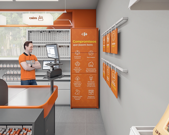
Photo Credit: Aquadrado Arquitetura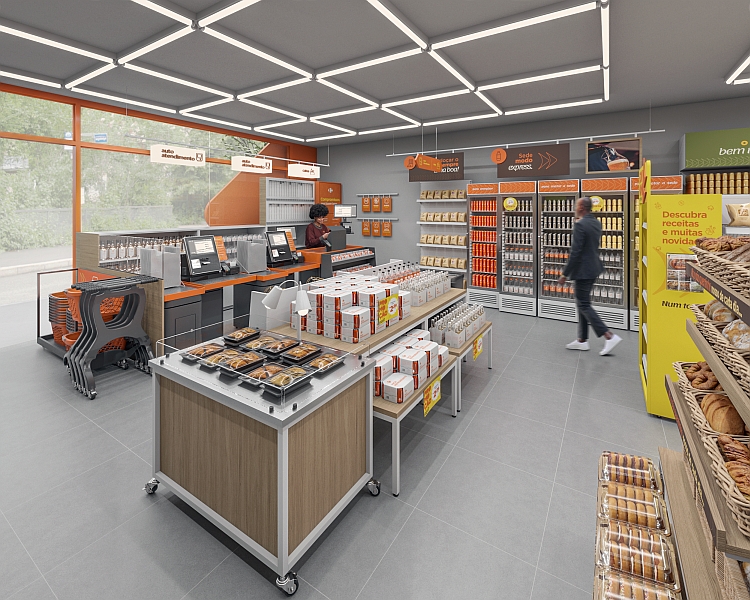
Photo Credit: Aquadrado Arquitetura
The finishing materials chosen are neutral, easy to apply, giving prominence to visual communication, which has as its main element a clothesline, in which plates are fitted and can be easily changed and removed if necessary for campaigns or promotional actions, .offering flexibility to the operation
For the re-reading of Carrefour Express, a new color palette was proposed, keeping the institutional ones, but adding complementary colors that make up the space and communicate in a more democratic and youthful way. Orange remains the color associated with Carrefour Express, and the other colors bring more life to visual communication, indicating the different sections of the store, such as fruits, vegetables and frozen products.
The tagline 'Entered Express mode, enter here' was developed, conveying the idea of a fast-paced, everyday life, in which practicality and agility are fundamental. To reinforce the message, a new symbol was created, based on a deconstruction of the Carrefour logo, used to convey the feeling of movement and agility, in addition to contextualizing that the new store is younger, has a welcoming tone of voice and connects with the place where it is inserted.
Some store designs also offer a coffee area with a microwave, where customers can purchase a coffee to drink on-site or take with them and heat up a frozen meal purchased in-store; and a community panel, which can feature store staff, information about neighbors, and promote events in the neighborhood. The entrance to the store is marked by a welcome communication, which speaks to the Group's purpose, observed throughout the customer journey in the store. 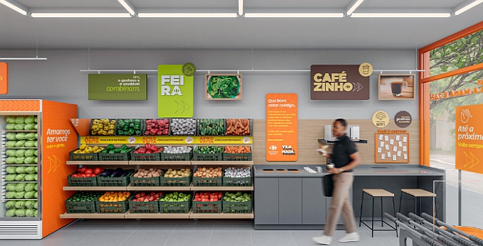
Photo Credit: Aquadrado Arquitetura
|
||||||||